There’s a moment that happens in every data meeting. Someone pulls up a dashboard, points at a spike in the chart, and asks, “So… what does this actually mean?” Then comes the scramble: switching tabs, pulling up filters, cross-referencing three other reports, just to answer a simple question.
While building AOne, one belief shaped everything we did: data-driven dashboards are powerful, but they’re only the beginning. We always believed that talking to your system could fundamentally change how you use a platform. In fact, we designed an Ask AOne component in our initial wireframes, a feature that throws intelligent suggestions based on your user profile and asset performance.
This is where data-driven UX is heading now: from static charts to intelligent, conversational systems that respond like a thoughtful colleague who knows your data inside out.
From Staring at Dashboards to Conversing With Them
For years, we’ve been perfecting the art of visualisation. Heat maps. Line charts. The combinations, what not. We’ve gotten really good at translating millions of data points into something the human eye can parse. And that’s been revolutionary, don’t get me wrong.
But here’s the thing: visualisation was always a workaround. It’s what we needed when computers couldn’t talk to us, when the only way to understand data was to look at it.
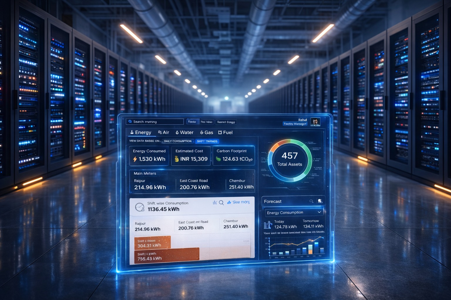
Imagine opening a dashboard and instead of scanning through multiple widgets, you simply ask, “What should I focus on today?” The system responds with precise insights, trend highlights and recommended actions. This is what automated recommendations and generative analytics make possible. By using AI to analyse data patterns in real time, businesses can get clear signals rather than endless numbers.
The Three Pillars Reshaping Data UX
1. AI That Actually Understands Context
We’ve moved past the era of “dumb” automation that just alerts you when numbers cross arbitrary thresholds. Today’s AI-powered analytics can understand the story behind your data. It knows that the small spike in your temperature could be just the store purchase, but if it’s 3 AM and correlates with a string of error messages, you’ve got a problem.
Modern recommendations aren’t just reactive; they’re proactive.
The system learns your patterns, understands seasonal variations, recognises anomalies that matter versus statistical noise, and surfaces insights you didn’t even know to look for. It’s like having a data analyst who never sleeps, constantly watching your metrics and tapping you on the shoulder only when it’s important. The next wave will bring personalised analytics assistants that adapt to each user’s role, preferences and goals.
2. Generative Analytics: Your Data Tells Its Own Story
Here’s where things start to get exciting. Generative analytics does more than display a chart. It writes the story behind it. It can produce executive summaries, craft narrative explanations of trends and even draft the email you might send to facilities leadership about why energy costs spiked last month.
Imagine asking your dashboard: “Why did the energy consumption increase last month?” and instead of getting scattered charts, receiving a clear story: “Energy usage rose by 18% mainly due to an extended cooling cycle during peak afternoon hours. A heatwave in the third week caused HVAC systems to run 25% longer than usual. Two facilities showed the sharpest spikes, both with outdated insulation, which amplified the load on the system.”
That is the strength of generative analytics. It does not replace human insight. It enhances it by taking care of the complex data connections and letting you focus on what really matters; making smart decisions.
3. Conversational Interfaces: Ask, Don’t Search
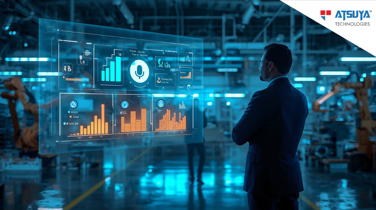
This might be the most transformative shift of all. The next generation of dashboards no longer needs you to know which tab to click, which filter to apply or how to build a complex query. You just ask.
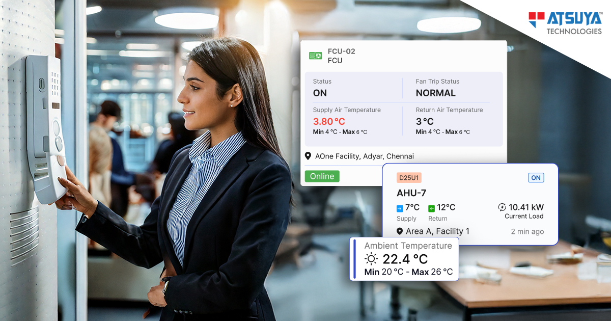
“Show me the sites with the highest energy spikes.” “What caused the surge in HVAC usage last week?” “Compare this month’s energy efficiency with last month’s.”
Voice and chat interfaces are turning energy data monitoring from a specialised task into something anyone can do. There’s no need for advanced training or digging through countless reports. All you need is a question.
And here’s the best part: conversational interfaces learn the way you talk. Over time, they understand that when you ask about “consumption,” you mean total energy usage across facilities, not just lighting loads. When you ask about “performance,” you’re referring to HVAC efficiency metrics, not general system uptime. It’s data, but in your language.
Rethinking How Dashboards Are Designed
The way dashboards are built is entering a new era. They’re no longer just spaces for displaying data. They’re evolving into intelligent systems that understand users, speak their language and guide them towards action. This shift demands a different approach to design, one that focuses on interaction, clarity and trust.
– Personality and tone: The assistant behind the dashboard needs a clear voice. Whether professional and approachable or direct and data-focused, how it communicates shapes how users connect with the product.
– Progressive disclosure: Conversational interfaces require focus. You can’t flood users with data all at once. Information has to be revealed gradually, at the right moment and with the right depth.
– Trust and transparency: When AI gives an insight or makes a recommendation, users should know why. Building trust means designing clear explanations and showing the reasoning behind every suggestion.
– Multi-modal experiences: Not every question is best answered through text. Sometimes users want to talk, sometimes they want to explore visuals. The best dashboards blend both seamlessly, letting users switch between conversation and exploration without friction.
The Human Element Remains Central
At the heart of every insight, there is still a human making the call. AI can detect unusual patterns. Automation can build reports. Conversational interfaces can make data easier to access. But people bring context, intuition and judgement that no dataset can replicate.
The goal is not to replace human decision-making. It is to strengthen it. By removing the grind of manual data work, we create space for people to focus on creative problem-solving and strategic thinking that drives real impact.
This is where product design has a real opportunity. We are not just building dashboards anymore. We are designing conversations, guiding decisions and creating experiences that make data feel alive.
And the most exciting part? We’re just getting started.